


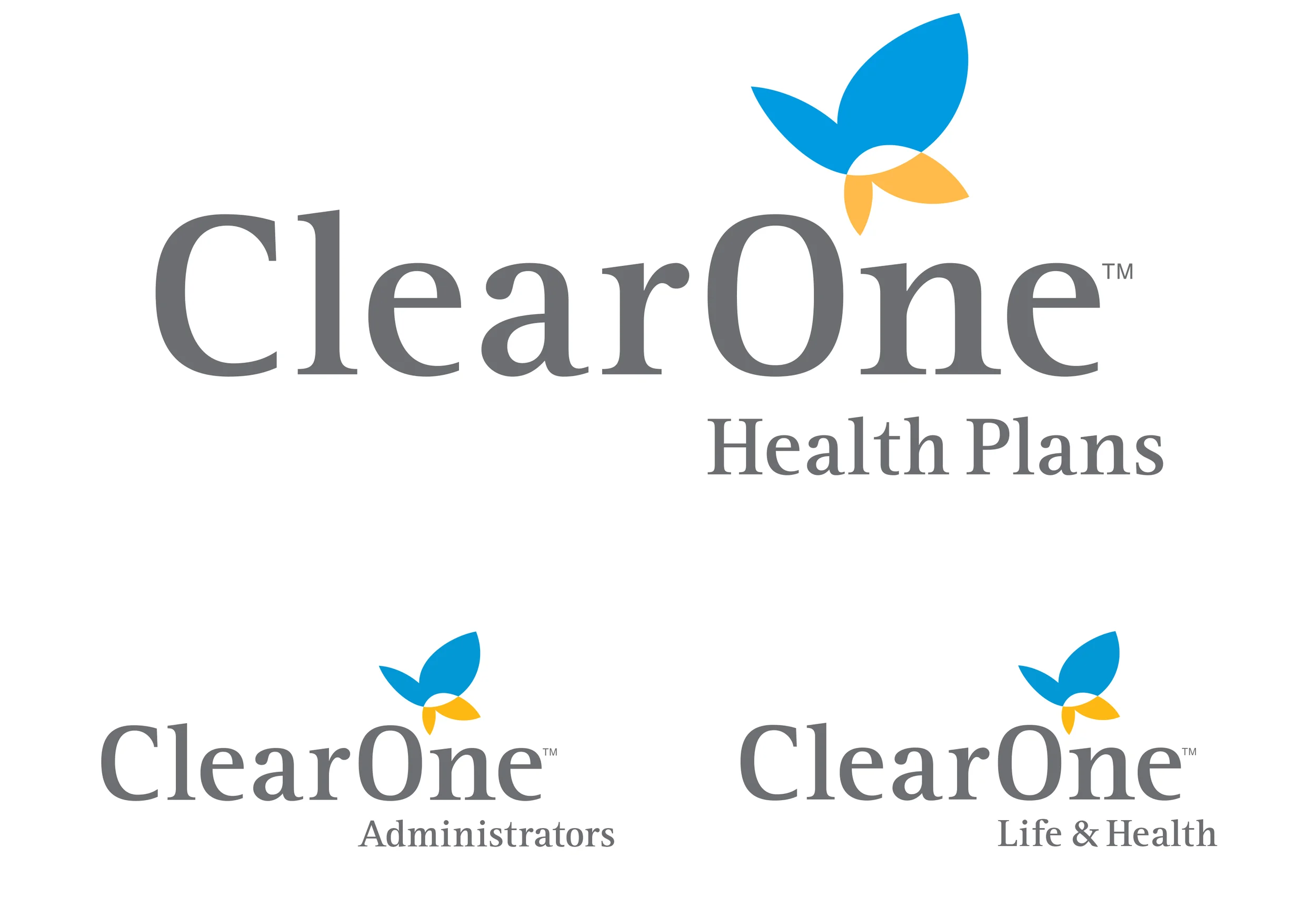


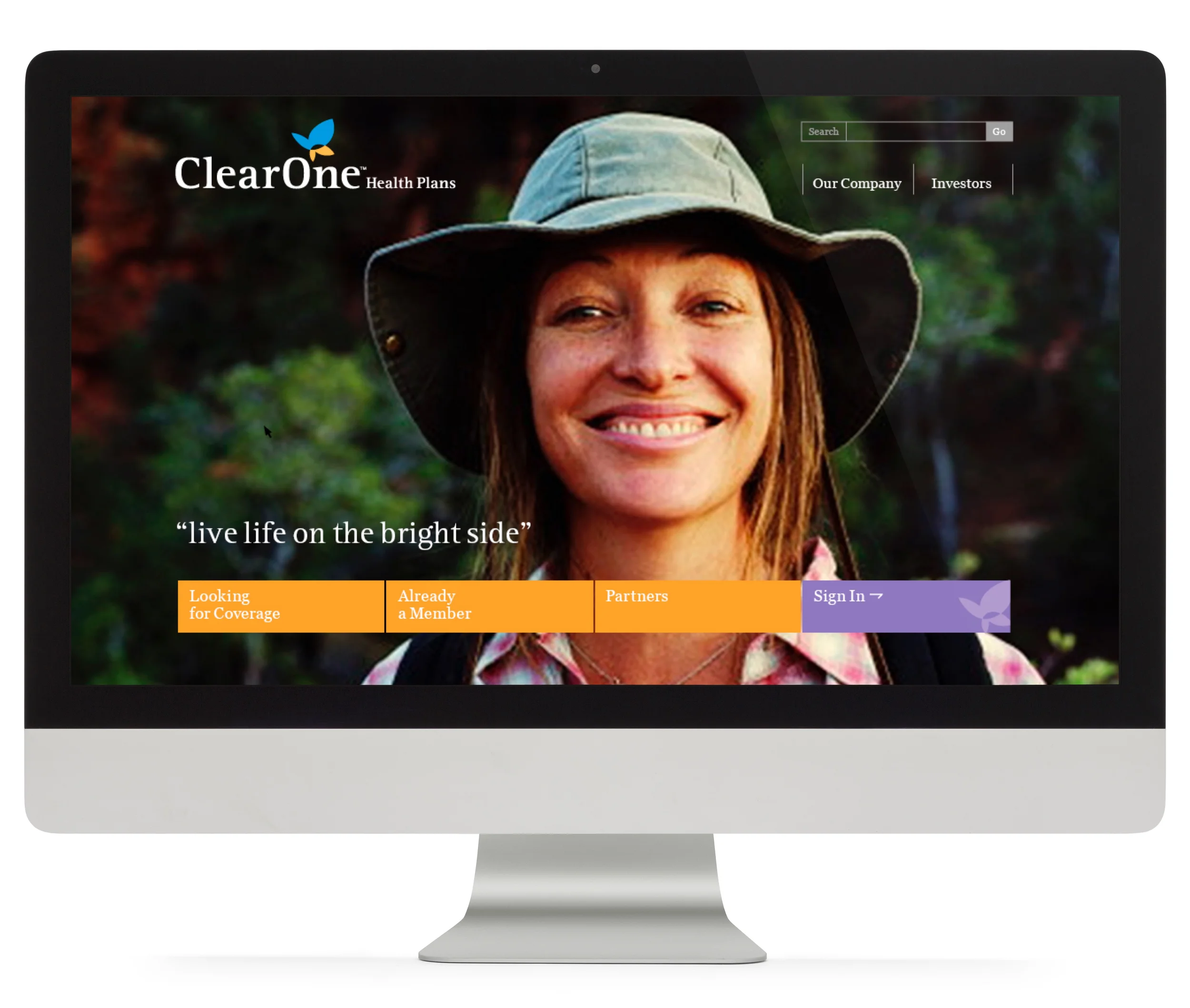

ClearOne Health Plans is a leading provider of health insurance in Central Oregon.
Brand Challenge
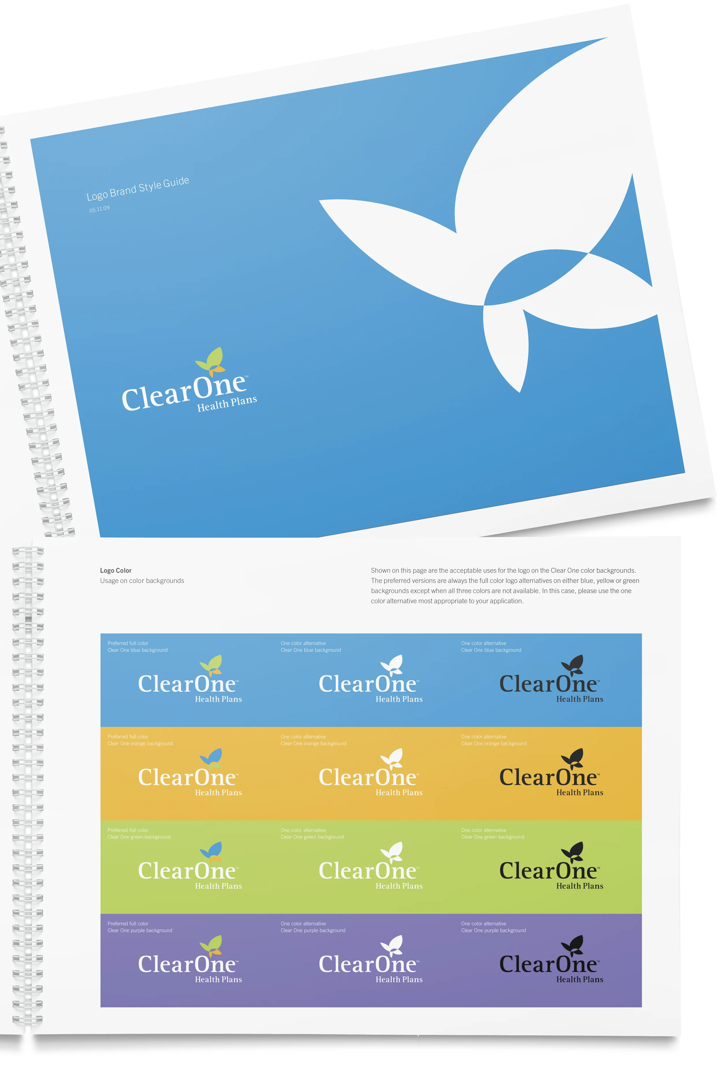
With a name change from Clear Choice to ClearOne Health Plans, we were charged to define a brand strategy and create and updated brand identity system to appeal to their broad market audience.
Solution
We created and recommended a brand identity with the centerpiece of a stylized butterfly as a symbol of caring, assurance, health and wellness. While many health insurance identities appear corporate and impersonal, the butterfly is an approachable visual, signaling care and representing a brand position and promise of providing peace of mind and assurance to the worries and concerns about healthcare costs and coverage.